VIER DE VERBINDING / CELEBRATE THE CONNECTION
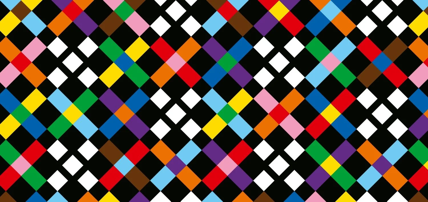
De Progress Pride Flag, de regenboogvlag en de ontwikkelingen in de LGHBTI+ community vormden het startpunt voor een uitgebreid onderzoek van verschillende Pride vlaggen.
De betekenisvolle kleuren inspireerden Claar Delfsma tot een reeks ‘colour connections’, waarin verweven kleurverbindingen een nieuw perspectief op de herkenbare pride kleuren geven. De expositie omvat naast een selectie van drie panelen een reeks afgeleide banieren in de Passage. Laat je inspireren en vier de verbinding!
Naast creative partner van DPID is Claar Delfsma beeldmaker en / fotograaf. Het vrije werk van Claar geeft een andere kijk op het gebruik van kleur en vorm in het sociale domein. Na de Rietveld Academie heeft ze in binnen- en buitenland uiteenlopende projecten ontwikkeld en gerealiseerd.
—
The Progress Pride Flag, the rainbow flag and developments in the LGHBTI+ community formed the starting point for an extensive study of different Pride flags.
The meaningful colour combinations inspired Claar Delfsma to create a series of 'colour connections', in which interwoven colour connections give a new perspective on the familiar Pride colours. The exhibition includes, besides a selection of three panels, a series of derived banners in the Passage. Be inspired and celebrate the connections!
Besides being a creative partner of DPID, Claar Delfsma is an image maker and / photographer. Claar's free work provides a different perspective on the use of colour and form in the social domain. After graduating from the Rietveld Academy, she developed and realised various projects at home and abroad.
Helen Parkhurst is een middelbare Daltonschool voor mavo, havo en vwo. Daarnaast is de school is ook een technasium met speciale aandacht voor cultuur en maatschappij, milieu/duurzaamheid, ict, topsport en internationalisering
Naast de merkstijl verzorgen we sinds 2012 samen met de Helen Parkhurst jaarlijks een breed scala aan communicatie-items voor de werving van nieuwe leerlingen, zoals: Campagne met posters, schoolbrochure, flyers, beknopte schoolgids, ondersteuning van de website vormgeving en diverse marketing uitingen.
____
Verhuist je school, is er een fusie van scholen of start je een nieuwe opleiding? We hebben de expertise in huis om je jullie te helpen met de (nieuwe) huisstijl en merkcommunicatie waar je jarenlang plezier van hebt en trots op kan zijn. Neem vrijblijvend contact op om de mogelijkheden te bespreken!
Background
Getting familiar with the wealth of literature at a young age, De Schoolschrijver improves social opportunities for children. De Schoolschrijvers are genuine children’s authors, teaching in the classroom once a week for six months. (De Schoolschrijver is the dutch name for writers in a classroom) They bring enthusiasm for reading, writing, stories and passion for language to the school children. The language skills of children increases measurable.
Challenge
Dirk Pieter van Walsum, brand strategist at DPid: “The Schoolschrijver has many stakeholders, the writers, schoolkids, teachers, parents, sponsors. All with different interactions with the brand." A symbol, easy to understand, with a positive vibe and disrupting expectations.
Solution
DPid translated this wonderful purpose into a visual identity. Translating the brand essence – reading and writing – into one symbol. Reading, seeing, in the broadest sense. An open mind, ready to tickle the imagination. The pen as clear symbol for writers, writing and storytelling. A modern ‘storytelling’ logo with a subtle book reference. full of symbolism and movement.
We delivered: brand consulting, created the new logo and corporate identity, the webdesign and a wide range of marketing / communication items.
More information about De Schoolschrijver on the website.
Met veel plezier hebben we de art direction en het ontwerp van het studieboek Creating a playground for C.L.A.S.S. (Character, Leadership and Social Skills) verzorgd.
Het engelstalige studieboek heeft als doel op een heldere manier leiderschaps- en sociale vaardigheden van studenten te verbeteren. Het boek wordt uitgegeven door Insite / Reckoning,
Zelf dit boek van 140 pagina's in handen krijgen? klik hier om het boek te bestellen
Shawna Snow, Director of Reckoning over het ontwerp: You guys did an amazing job!! I am so happy with your work, your eye for detail. I am so grateful for all your hard work! Thank you so much!
Background
Helen Parkhurst is a secondary school based on the Dalton vision, emphasizing the development of technasium, culture and society, environment / sustainability, ict, sports and globalisation. principles are: freedom in assignment – independence – cooperation.
Challenge
Dirk Pieter van Walsum, brand strategist at DPid: “Helen Parkhurst asked us to develop a specific and meaningful identity for a bright future of the School. Many stakeholders, schoolkids, teachers, parents, staff have different interactions with the brand. We set out to make it very easy to understand and offer a sense of comuninty.
Solution
Claar Delfsma, creative director DPid: "The new logo /identity represents multi coloured facets symbolizing connection, versality and growth. Applicable for consistent communication on different school levels. The strong brand identity with a positive vibe and a a shared visaul language is a major step forward".
We develivered: brand consulting, created the new corporate identity, the webdesign, signage and a wide range of marketing / communication items.
Voor de zevende keer op rij mocht DPID het jaarverslag van De Schoolschrijver ontwerpen. Samen met de eindredacteurs Corien Baart en Doris Zevenbergen is er in korte tijd weer een prachtig verslag over het afgelopen jaar gerealiseerd.
Veel vernieuwingen deze keer, naast een nieuw omslag ontwerp, zijn alle belangrijke kentallen op een nieuwe manier glashelder gepresenteerd op de eerste pagina’s. In het hart een overzicht opgenomen met alle 77 huidige schoolschrijvers.
Net als in de voorgaande jaren, hebben we er een vlot leesbaar jaarverslag van gemaakt met een magazine-achtige uitstraling.
Een optimale balans tussen tekst, fotografie, mooie illustraties en heldere infographics zorgt ervoor dat het jaarverslag zoveel mogelijk relaties bereikt en professioneel informeert over alle activiteiten van De Schoolschrijver.